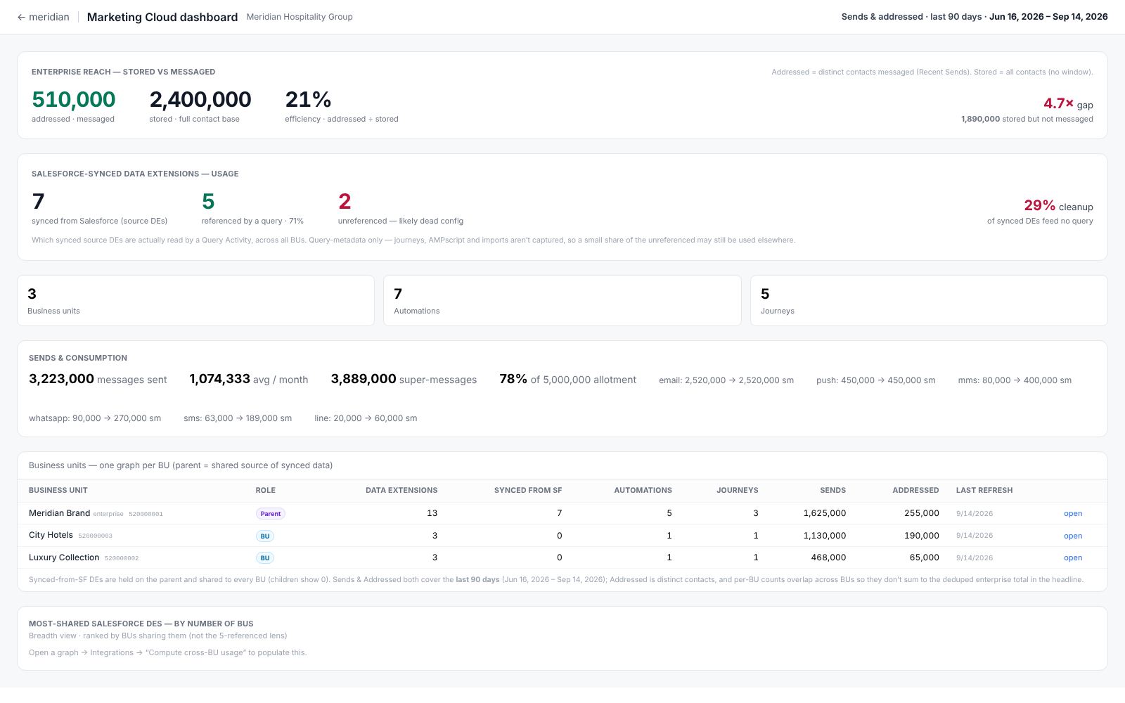
The dashboard is the enterprise view — every business unit in the folder rolled up into one read. It’s where you go to answer “what is this whole account doing” without opening each BU in turn.
Opening it
Open the dashboard from the Dashboard button on the enterprise folder. It reads the stored results of the last refresh, so it loads from settled numbers rather than re-scanning the account. If a figure looks stale, refresh the folder — the dashboard shows the last scan, not live data.
Sends and consumption
The headline is sends and super-message consumption over the trailing 90 days, deduplicated across business units so a contact messaged by two BUs isn’t counted twice at the enterprise level. A per-month average sits in the same box as the total, and the window dates are stated plainly so the period is never in doubt.
Shared data extensions
A card ranks data extensions by the number of business units that reference them — the breadth lens from Integrations. It answers “which synced sources are shared most widely,” which is a different question from how many are referenced at all. Read it as a heads-up on shared dependencies, not as the usage total.
Addressed and stored, rolled up
The dashboard carries the same addressed-versus-stored contrast as the Cost & reach tab, enterprise-wide: how many distinct contacts the account reached in the window, against how many it stores. The gap is the account’s unreached population — the clearest single signal of contacts you carry but don’t message.